Design Simplified: Going From Jars for Weed to a Modern Ashtray and Stash Jar
The design process is not some magic formula that exports a one-size-fits-all sequence, nor does it line up the same every time. We thought this would be a good opportunity to illuminate our processes when it comes to design and composition for our award-winning products. From notepad sketches to 3D models, here is how we took a problem and turned it into glass.
Getting From Mind to Matter
Step 1:
It seems obvious that our brand would naturally motion towards other accessories like ashtrays. We have certainly seen our fair share of them over the years and been mostly willing to accept the unpleasant odor and the accumulation of ash, often difficult to clean. We had a similar notion when it came to stash jars, as its function did not appear to need radical improvements. However, we considered what exactly a Session version of these accessories would look like, what they would do, and most importantly, what problem(s) would be solved.

This turned into a series of lengthy design sessions that went from observing and analyzing already made pieces to drawing out what we loved and didn’t love. Why do we not see lids? Would that be the solution to controlling odor? Do we really need a poker? Can we make an ashtray that effectively does the same job twice by scraping residue and collecting ash? Is there an easier way to clean these things? Should a stash jar stash more than just flower? These questions motivated us in our ideations and vision towards minimalistic aesthetics.
From Minimal Design to Maximal Systems
Step 2:
The next step was to understand how the Ashtray and Stash Jar would be positioned in the lineup. One of the major hurdles in designing new products in an already existing set of pieces is in keeping with the logic of the brand while displaying unique components. In other words, our brand has a vernacular and we need to match it with each unit’s individual voice.


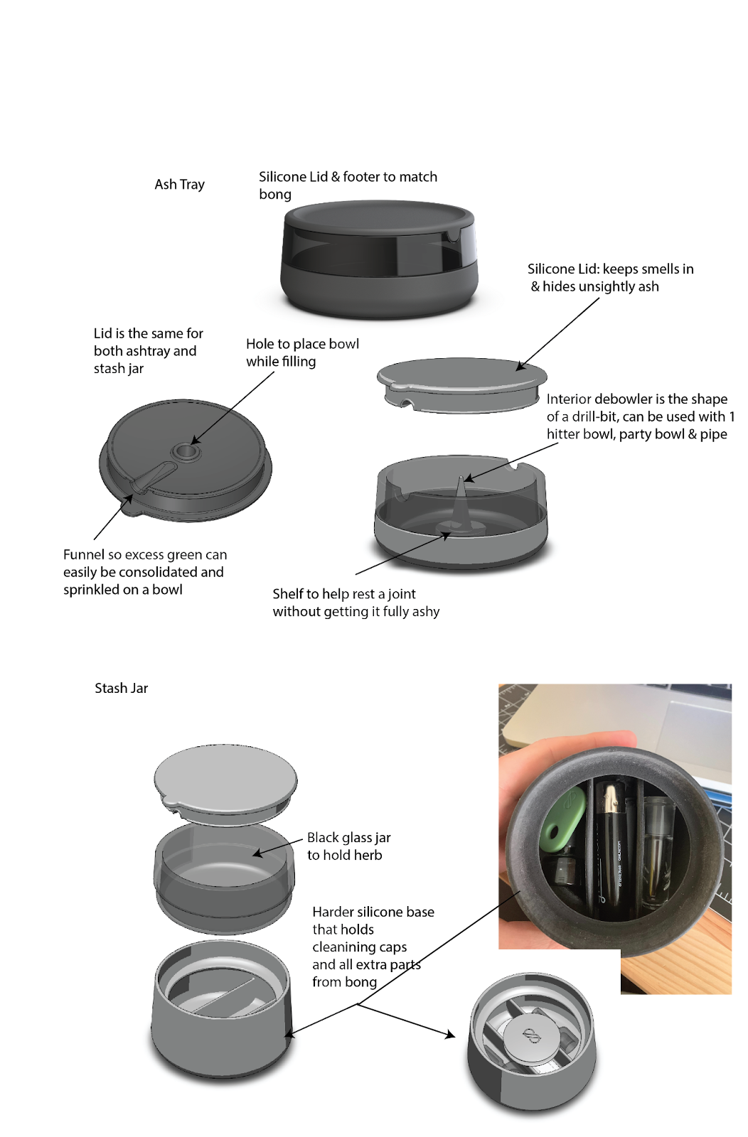
We started from the ground up — literally. Taking inspiration from the footer on our Bong, both the Stash Jar and Ashtray replicate similar features from their curvature and clean edges to its symmetry. The focal center of the Ashtray should be the poker. The radius can terminate at the indents. As for the Stash Jar, we liked the two-in-one approach we leaned into with the Ashtray. Making the Stash Jar function in the traditional sense, where it houses your flower, while integrating more space to store more components reimagines the scale of organization that a stash jar typically offers. This was, of course, all in theory and had yet to be tested.
3D Printing: Like The Easy-Bake Oven but for Designers.
Step 3:
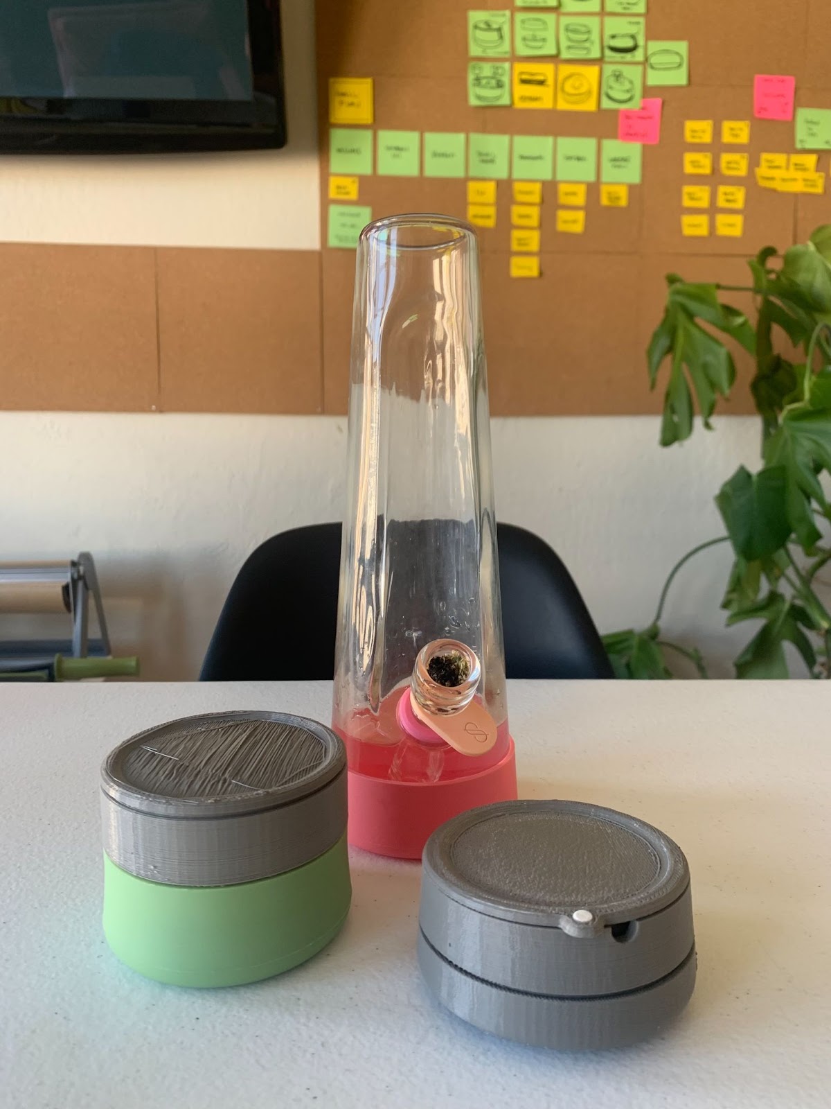
Before samples were ordered, we made multiple CAD files to assess form in relation to function. If it does not meet the criteria for looking good, feeling good, then we chart successful components against the less-than-successful components. Printing these out allowed us to get under the hood of how each design worked. Just don’t test live embers on them. Trust us.


3D printing is a lower-stakes method for envisioning the final product in a tangible way that does not require us to execute a costly sample order only for the units to be less than desirable. Taking this step allowed us to tailor the broadest details so that we could focus on the finer textures of the Astray and Stash Jar before we test out samples and then move into the final stages of production. Even in this step, we continued to press ourselves with the same questions we asked in the early sketches. Perhaps most critical were the new sets of questions born out of this process. Many times over, every question will unfold into a full new series of paths. This, to us at least, is the fun part.
Part and Parcel in Two Stages
Step 4:
Once we had a clear understanding of each unit from the prints, we began to consider the materiality of each piece. Could the lid be universal for both the Stash Jar and Ashtray? Aside from the debowler, is there a way for each piece to gesture towards the Bong? Do we need to adjust the thickness of the silicone? Is there a way to suggest a circular sequence in the very function of each piece? In other words, can your smoking session start and end using only these products? How can we elevate that?
This step is crucial in shaping the final product before it’s sent out for sampling. This is by far the most technical stage. We wrangled all those initial abstract ideas and questions and reproduced them as finely measured textures—glass and silicone. This phase seems simple enough but even a seasoned designer isn’t immune to mismeasuring a component. Yet, sometimes, micro errors can lead to macro ideas. For instance, the hole in the top of the lid was initially meant to compensate for the height of the debowler, but when the hole appeared too wide, we realized it was the perfect size to hold the bowl upright. Call it kismet or a happy accident.
Sample —> Production
Step 5:
Here is when we stop considering the ceremonial or customary aspect of smoking and focus purely on the mechanics. When samples come in, we first look at whether the folks we sourced from fulfilled our specs. Remember that not all producers are equally equipped to handle every specification. This is not to say that any producer is better or worse, but our concern is to find the right one that fits our needs. Some producers specialize in a more cost-effective soda-lime glass and can make dazzlingly elegant ware that would be a good fit for specialty soda bottles, jars, wine bottles, and so on, but that’s for another company. We require borosilicate, which can be a bit trickier.
When it comes to specs, how much is too much and how much is too little? We spent a lot of time thinking about glass thickness down to the precise millimeter, but how should we think about margin of error? In each sample, we expect a certain degree of flawed pieces. This becomes a threshold where we judge whether the sample succeeds or compromises the design. And while all of this seems like it could be entirely in the hands of the producer, it’s not. We had to spend a lot of time scrutinizing our own calculations and measurements. The first run showed us that the heat tolerance for the debowler was too low, so we had to reconsider the material it was made with. The sample process is really the only stage that bears out these necessary adjustments, but it’s a critical segment. It’s as close to the real thing as we get to before launch.
After samples comes packaging. While this is not the centerpiece of the design process, it is an important step to consider before making them available. Is the packaging easy to handle? Will it be difficult to ship? When we distribute them to retailers, are they easily stackable? Are they going to have odd dimensions? We also want to be conscious of the materials being used both ethically and environmentally. These are mostly technical questions, but entirely necessary. It’s this approach that helped us produce award-winning packaging back in 2019.
The final step is: you.
Every bit of feedback is circulated amongst our team and considered well after launch. If you have taken time out of your schedule to share your thoughts, we value every word. Nothing gets done in silence. In our minds, the last stage of our design process is understood as a continuous unfolding sequence. The process flows with every new question that arises from our product being out in the world. Nothing is ever settled and we’re content with that.
Thank you for reading. We hope this insight into our methodology has been as interesting to you as it is to us.


